Basic Bleed Techniques in Design and Print

What makes a printed piece leap off a page? Some say it’s the dimensions of the designs, the vibrant hues of the ink, or the dazzling gloss finishes. But part of the beauty is the way the layout itself captures your eye. When white space is appropriately utilized (or eliminated completely), the contrast can be breathtaking. But often clients don’t understand the technical details of planning for appropriate margins, through the use of full or partial bleeds. A Common Mistake Worth Correcting One of the most frequent amateur design mistakes is allowing for insufficient bleeds before sending a project to print, causing the effectiveness of the design to be weakened or essential parts of the layout to be cut off unexpectedly. This month’s print tip, added to the Ideas Collection of every website provided by Marketing Ideas For Printers, coaches your clients on the basics of bleed techniques in print. The August print tip article trains your customers on eliminating unwanted white space and understanding trim and fold markings as you build a print proof together. Though today’s software offers default values for creating bleed margins, here are a few tips to coach clients on when to use them: Bleeds
A Ballpark Home Run

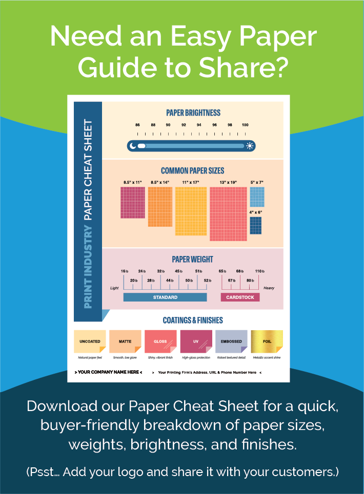
It’s important to take great pride in offering your customers the best quality work. After all, your commitment to your customers involves not only excellent craftsmanship but accurate estimates that save time and stress (for both you and your customer) along the way. Keeping the Numbers in Check The December print tip, available on every website provided by Marketing Ideas For Printers, gives your clients a handy guide for preparing a project with limited hassle. Often those inexperienced in print basics find themselves swamped in confusing conversations or multiple trips to and from your office. Here are a few tips highlighted for your customers from the article that will help your patrons keep their estimates in the ballpark! Weight of Paper. This can vary based on the type of publication and the specific needs of each client. Often it may be best to trust printer recommendations based on project specs. Folding and Binding Options. Folding is ideal for some projects while binding is best for others. This print tip walks clients through four binding options and the most common, standard folds. Narrowing options upfront can offer a huge head start. Colors and Bleeds. Often customers get confused about the precision
The Delicate Dance of Decision

Have you ever entered a furniture store and been bombarded by overly eager sales associates? Though you were originally in a buying mood (and the price was just right!), you just couldn’t commit. Why? A classic case of “too much, too soon.” Sales are more than just transactions, they involve a journey of decision. Push too hard, and customers run. Keep it too casual, and they put off decisions. What is the ideal balance? Creating a sales funnel, or content path, for people to follow is one way to engage prospects through every step. This month’s marketing tip, available in the Ideas Collection of every website provided by Marketing Ideas For Printers, describes three “buckets” that offer guidance and appropriate information at just the right time. Top of the Funnel: Awareness People don’t typically begin their journey with an intent to commit. They have to be gradually convinced! This begins with building awareness, which is purely informational, not promotional. Casual placements may trigger a hidden interest that prompts them to move forward. Middle of the Funnel: Consideration Once you’ve built awareness, your content marketing should shift toward the direction you want them to proceed. While you are not making a
New Print Tip: Win Customers With Colorful Packaging
Color is your world. It’s part of what you do every day. You know how color emphasizes your perception of the products it appears on, and so do your customers. Or maybe they don’t. That’s why it’s a good idea to remind your customers that they can Win Customers With Colorful Packaging. That’s the topic (and the name of!) the newest Print Tip added to the Ideas Collection of every website provided by Marketing Ideas For Printers. Here are the three tips your customers will see when they visit the Win Customers With Colorful Packaging tip on your website: Ask yourself which one color gets your message across. Always plan a family of products and marketing assets in advance. Always do a color-accurate printed proof. The tip finishes with this mandate: Always consider how things will look and how they will make your customers feel. By keeping these vital color rules in mind, you can create packaging, brochures and other assets that make your brand attractive to consumers and easily recognized. Here’s how Win Customers With Colorful Packaging is presented on one of our public demo websites. With content like this, you will always be the expert your customers turn to when they’re ready to print their
New Print Tip: 5 Rules for Readability with Type
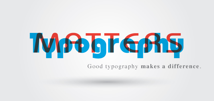
Typography is SO important! You know it, and now you can make sure your customers and website visitors know it, too! 5 Rules for Readability with Type is the newest tip added to the Ideas Collection on the websites provided by Marketing Ideas For Printers. The five rules presented in this tip include: Keep typography simple. Stay consistent. Use upper and lower case. Keep lines short and add white space. Use serifs. These rules are presented to your customer in a format that includes examples on why the rule is important, and how to implement each rule in practical, day-to-day usage. For printers using websites from Marketing Ideas For Printers, this new tip can be found in the Print Tips section of the Ideas Collection. (Not using a website from Marketing Ideas For Printers? You can see the tip here on one of our demo websites.)
The MI4P Process
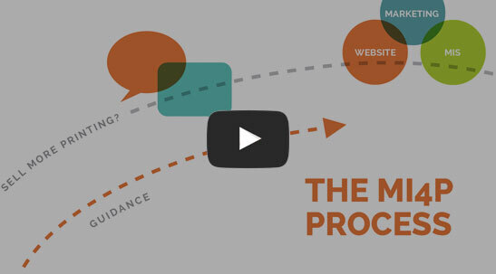
This two-minute video will show you how we take you through Our Proven Process. No surprises; no bumps in the road!
It's worked for hundreds of printers just like you; it will work for you, too! Download the MI4P Proven Process PDF below, and follow along.
PDF: The MI4P ProcessSay Hello
"*" indicates required fields
Who We Are
What We Do
Marketing Ideas For Printers
5990 14th Street South
Fargo, ND 58104
(701) 241-9204 (800) 736-0688
© 2026 Marketing Ideas For Printers
Our Privacy Policy | Terms of Service