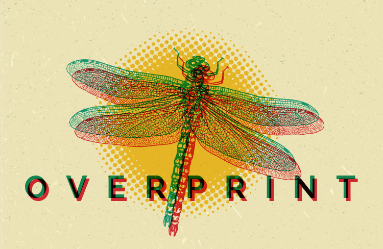
Are your customers looking to make a splash with creative new approaches to printing? Perhaps they’d like to try intriguing designs that would traditionally be quite difficult or expensive. This month’s print tip, available on every website provided by Marketing Ideas For Printers, introduces your clients to some delicate aspects of overprinting, a marketable technique to your customers that can be used to blend colors, text, or layering to add dimension without busting the budget.
Jump Right Off the Page
In our April Ideas Collection, your customers will learn more about how overprinting adds depth, texture, or interesting detail. It will inform your readers on how traditional design software knocks out any text or line overlaps to avoid a muddy appearance and call attention to crisp edges in each printed product. But, they can use overprinting to bypass this default, adding breadth to visible edges. This slight trick of thickness can make their image appear to jump off the page, adding some zip and complexity of color.
As you coach your clients on keys to overprinting, this tip will remind them that the order of coloring is foundational. If they’re overprinting several colors, for example, they wouldn’t want to design a project with the lightest color in the back. A darker foreground color might easily overwhelm the lighter shade.
From Flat to Fantastic
While the final result depends on how each project is implemented, your readers will appreciate how overprinting can provide a measure of depth that is often missing in projects printed on a flat piece of paper. Have fun educating your clients on how creative overprinting techniques can be worked into their next print project!
Preview this tip on one of our demo websites or give us a call at (701) 241-9204 or (800) 736-0688 to chat more about our no-risk website trials!


