Good website design for your print company could mean the difference between getting an online order and being passed over for a competitor.
But why?
Isn’t a good website design like art? Isn’t it relative and dependent on the eye of the beholder? Not exactly. Your website design has to accomplish three critical things:
- Your website design should create a great, easy-to-use user experience.
- Your website design should translate competency. In other words, a good website design = a competent print business.
- Your website design should help to create trust in your print buyer.
Here are seven best practices you can follow in your website design to help you get there:
1. Color Harmony
While it’s true that you can print any color in the rainbow, it’s not necessarily a good idea to use them all on your website.
Sensory overload can backfire and send people running to a more professional-looking printer. Let photo graphics provide the ‘full-color’ on your website, and keep your color palette simple and inspiring.
“Good design is good business.”
– Thomas Watson, Jr.
2. Let Them Scroll
There’s no need to pack everything into the top portion of your website anymore.
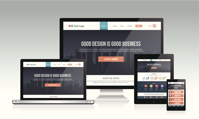
Times have changed. Remember, many people are viewing your website on phones and tablets, and they are OK with scrolling as long as the information is presented clearly and concisely.
3. White Space is Our Friend
White space improves readability.
It gives our brains a break between sets of information, and it provides the much-needed space for searching eyes to enter into a new area.
4. Clean, Clear Images
Use strong, professional images that capture the craftsmanship of the printing process. Make your website your own by personalizing your site and showcasing projects that you are proud of.
“Your website is one of the first impressions that someone will get of your business.”
– Stoney Degeyter

5. Something Has to Win
Beware of battling elements.
‘Tis better to show one attractive stand-up banner and a call to action on your slider than to show fifty little stand-up banners, a headline, a starburst, and a flashing “order now” button.
6. Consistent Style
Pick a look and feel and stick with it.
You’ll present a cohesive website experience when you stay consistent with your fonts, margins, and photography style.
7. What’s the Point?
What is the ultimate point of your website? What are you hoping to have your print buyers do? Place an order, correct?
Your website design should create an easy-to-follow path for your visitors. Be mindful of how your visitors might come to your website and what you want them to do next. Eliminate the confusion of multiple call-to-action buttons and instead narrow in on the path you want them to take.


