October is a month for bold color, changing leaves, and messages that stand out, and that makes it a fitting time to remind print buyers that the quality of their printed materials says something about their business.
When deadlines are tight, the office copier may seem like the quickest solution. But faded color, inconsistent output, limited paper choices, and rushed finishing can weaken an otherwise strong message. October’s marketing lineup gives you several ways to start that conversation, with professional color copies taking center stage across the direct mail packages.
Available for download now, these resources help your print shop show customers how better color, paper, finishing, and print expertise can turn everyday materials into polished marketing tools.

Direct Mail for Printers Subscription Options
FastStart
Help customers move quickly without letting their brand look rushed.
Type: 5.5″ × 8.5″ postcard and 8.5″ × 11″ foldover mailer
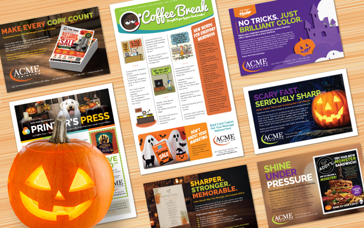
Centered around professional color copies, October’s FastStart campaign uses Halloween-inspired messaging such as “Scary Fast. Seriously Sharp.” and “No Tricks. Just Standout Color.” to show customers that quick-turn printing can still look professional.
The mailer and postcard promote color copies for flyers, sell sheets, menus, presentation pages, training materials, inserts, signs, newsletters, and other time-sensitive projects. They also highlight ways to elevate a basic copy job with two-sided printing, folding, collating, binding, upgraded papers, and cleaner finishing.
Why it works: FastStart gives your sales team a timely reason to talk about one of the most versatile services in the print shop. It helps customers see that “fast” does not have to mean “rushed,” and that professional printing can save time while strengthening their brand presentation.
Coffee Break Humor Newsletter
Keep customers smiling while giving professional color copies a subtle sales boost.
Type: Folded newsletter self-mailer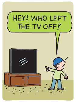
Size: 8.5″ × 14″ flat, tri-fold
Highlighting humor and everyday absurdities, October’s Coffee Break newsletter offers an easygoing way to keep your print shop in front of customers.
Sample jokes include:
“Someone broke into my garage last night and took a bunch of stuff, including my limbo stick. Seriously, how low can you go?”
And:
To the optimist, the glass is half full.
To the pessimist, the glass is half empty.
To the IT guy, the glass is twice as big as it needs to be.
The sidebar, “New Words for Everyday Weirdness,” introduces playful additions to the vocabulary, including Snackcident for the mysterious event in which one cookie becomes seven and Printuition for the strong feeling that a handout would look better in color.
Readers will also find a November calendar filled with historical milestones and seasonal dates, including Veterans Day, Black Friday, and Small Business Saturday.
Why it works: Coffee Break builds familiarity through content people enjoy reading while keeping your company name visible. The lighthearted format makes staying in touch feel natural, while the supporting print message creates opportunities for future sales conversations.
Local Edge
Show customers why professional print quality is one more reason to choose a printer close to home.
Type: 8.5″ × 5.5″ postcard; 9″ × 6.5″ EDDM option also included
October’s Local Edge postcard focuses on The Print Advantage, contrasting ordinary office copies with professionally produced color copies that deliver richer color, sharper detail, better paper choices, and cleaner finishing.
Headlines such as “No Tricks. Just Brilliant Color.” and “Copies That Speak Louder” support a simple idea: when printed materials represent a business, quality matters. Flyers, handouts, reports, and presentations all have more impact when the color is consistent and the finished piece feels intentional.
Why it works: Local Edge gives your print shop a clear way to demonstrate the value of professional production while reinforcing the advantages of working with a nearby print expert… YOU. It positions your team as the better choice when customers want their materials to make a polished impression.
National Direct Mail
Give prospects a coordinated campaign that shows how professional color can make every printed piece work harder.
Type: Multi-piece campaign featuring an envelope, postcard, mailer/self-mailer options, and social media and email marketing copy
The theme for October’s National Direct Mail package is making every copy count.
The campaign explains that color is more than decoration. Used strategically, it guides attention, highlights offers and calls to action, improves the clarity of photos and graphics, supports brand consistency, and creates a stronger first impression.
The mailer builds the case for professional production with benefits such as brighter and more consistent color, sharper graphics, better paper options, cleaner finishing, and guidance from print experts.
Why it works: National Direct Mail turns an everyday print service into a broader conversation about brand quality and communication. It gives prospects practical reasons to move customer-facing flyers, menus, reports, presentation materials, and handouts away from the office copier and into the hands of a professional printer.
Printer’s Press Newsletter
Combine seasonal lifestyle content, entertaining features, and a timely reminder that print quality makes a difference.
Type: 11″ × 17″ folded newsletter; self-mailer or envelope-ready
Featuring a wide variety of reader-friendly content, October’s Printer’s Press newsletter gives printers a useful relationship-building piece with plenty of reasons for customers to keep reading.
The cover article, “Healthy Pets, Happier Homes,” marks National Pet Wellness Month with practical reminders about checkups, exercise, nutrition, mental stimulation, and home safety. An alternate print-focused cover, “When ‘Good Enough’ Copies Aren’t Good Enough,” shows how faded color, inconsistent pages, thin paper, and copier problems can affect a company’s image.
Other highlights include “Fall Color at Itasca State Park, Minnesota,” which takes readers to the headwaters of the Mississippi River during the fall season, and Print in Action, which looks at how Fanta turned limited-edition Halloween packaging into an interactive campaign using recognizable characters and QR codes.
The newsletter also includes Owner Speaks, where readers are reminded that professional color copies offer sharper images, better paper choices, consistent output, and less time spent fighting the office copier. Trivia, a Top 10 Halloween Candy list, “Guess the Year,” a coffee wellness article, a customer-service story, a recipe, and other recurring features add variety.
Why it works: Printer’s Press balances useful business messaging with enjoyable lifestyle content. That variety helps your print shop stay connected with customers while naturally demonstrating the value of professional printing.
Ideas Collection
October’s Marketing Tip, “What to Say When You Only Have 3 Seconds,” focuses on creating printed messages that communicate value almost instantly.
Most postcards, signs, flyers, and direct mail pieces do not receive a careful first read; they receive a glance. The article explains how to make those few seconds count by leading with the main benefit instead of background information, giving each piece one clear job, and separating the primary message from supporting details.
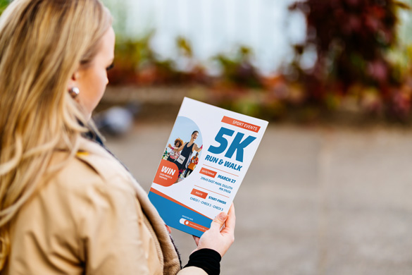
One practical takeaway is to remove words that do not help someone understand, believe, or act. Another is to make the next step impossible to miss by giving the phone number, URL, QR code, offer, or deadline enough visual prominence.
The latest Ideas Collection tip is available to all website subscribers and MI4P WordPress Plugin users.
Want to help print buyers create clearer, faster, more effective messages? Encourage them to read the full article and put these quick-read strategies to work on their next printed piece.
Put October’s Marketing to Work
From humor that keeps your name top-of-mind to coordinated campaigns that demonstrate the difference professional color can make, October’s content gives you several ways to stay in front of customers and start meaningful print conversations.
Make the most of these ready-to-use marketing resources while they are available for download. Choose the packages that fit your sales strategy, customize them for your print shop, and give customers another reason to bring their next project to a professional.
Want help choosing or launching your campaigns?
Reach out to talk strategy, fine-tune your messaging, and make print the hero of your June marketing.
Not seeing what you need? Explore Custom Marketing Services.