What happens when you pour water into a cup? It takes the shape of a cup. Into a fishbowl? It takes the form of the fishbowl. You see the pattern here; water always takes the shape of the container it’s poured into. The water responds to the container; the water is responsive.
It’s the same thing with website content: Website content takes the shape of the device displaying the content. Perhaps you’ve heard the phrase responsive website: The website content responds to the device that’s displaying the content, and that is what makes a website responsive.

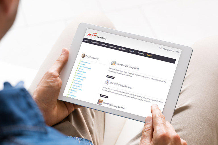
That’s why certain websites (like the one you’re viewing now) look great whether viewed on a desktop computer, a tablet, or a mobile device. Give it a try. Pull up this blog post on all your devices, and you’ll see the content beautifully displayed in a manner that fits the device being used.
The Mobile Tipping Point
There’s no shortage of studies showing the widespread adoption of mobile devices. As a planet, we crossed the tipping point in October 2016. (See Mobile and tablet internet usage exceeds desktop for first time worldwide.) We’ve not yet reached that level of penetration in the United States, but we will soon! (If you’re keeping score, here’s the freshest data for the United States.)
Websites from Marketing Ideas For Printers have been mobile-friendly for a long time now (since early 2012), but being mobile-friendly is not the same as being responsive. Get ready for responsive!
From Mobile-Friendly to Responsive
Let’s go back to the analogy of water taking the shape of the container it’s poured into. A mobile-friendly website would be like taking the water, changing it into something completely different (maybe by adding some coffee grounds to it!) and then pouring it into the container. It’s liquid, and still takes the shape of the container, but it’s not water anymore. It’s completely different content.
By contrast, responsive websites don’t change the content, just how the content is displayed.
Our Responsive Website Beta Tester
Our team has made big progress towards converting all websites from Marketing Ideas For Printers to incorporate the latest responsive website design techniques, and if you’re using a website provided by Marketing Ideas For Printers, your website will soon be updated to make the big and important jump from mobile-friendly to responsive!
That transition has already occurred for Felipe Martinez of SaveMor Printing! Felipe helped beta-test the responsive website development. Here’s what Felipe says about his responsive website:
Your team has been very responsive to our changes and needs. I also believe we have made some practical suggestions that can be considered system-wide. Overall, the experience has been good, and we have already identified a few customers using their mobile phones to reach us via the website.Just as a side note, we believe that by June 2017, 40-50% of our monthly website visitors will be using a phone or tablet. This number is really impressive and shows how the site continues to grow.
You can see Felipe’s website at www.savemorprint.com. Make sure to check out the SaveMor website both on your desktop computer and on the palm-sized computer in your hand.
Your Website Will Be Responsive, Too!
This responsive website update is an example of the ongoing development provided to all Marketing Ideas For Printers website customers at no additional charge. All current website designs from Marketing Ideas For Printers will be responsive by April 2017. That means if your website is powered by the current Marketing Ideas For Printers platform, there’s a big (free!) upgrade coming your way! As April approaches, we’ll narrow down the exact date and let you know when your website is responsive.


