Responsive Websites Are Coming Soon!
What happens when you pour water into a cup? It takes the shape of a cup. Into a fishbowl? It takes the form of the fishbowl. You see the pattern here; water always takes the shape of the container it’s poured into. The water responds to the container; the water is responsive. It’s the same thing with website content: Website content
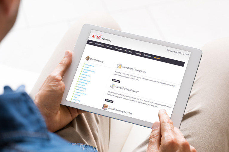
Mobile-Friendly in Less Than One Minute
Do you know anyone that does search engine optimization for a living? A typical day in their life might look something like this: Wake up. Put in an honest day’s work. Go to bed. Wake up. Discover that yesterday’s SEO rules no longer exist, and start learning new SEO rules. It’s not uncommon for Google to introduce big shifts to their ranking algorithm with
The MI4P Process
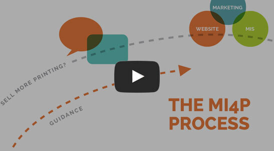
This two-minute video will show you how we take you through Our Proven Process. No surprises; no bumps in the road!
It's worked for hundreds of printers just like you; it will work for you, too! Download the MI4P Proven Process PDF below, and follow along.
PDF: The MI4P ProcessSay Hello
Who We Are
What We Do
Marketing Ideas For Printers
5990 14th Street South
Fargo, ND 58104
(701) 241-9204 (800) 736-0688
© 2024 Marketing Ideas For Printers
Our Privacy Policy | Terms of Service